In this article, we are going to explore the 'sweetalert2' plugin by integrating into a sample VueJs application.
Create A Sample Vue App:
Let's run the following commands to create a sample Vue app.
Command To Install Vue CLI Globally On Your System:

npm run -g @vue/cli
Command To Create Vue App:

vue create your_application_name
After creating a sample application run the following command to start the application.
Command To Run Vue App:

npm run serve
Install vue-sweetalert2:
Run the following command to install our plugin.
Command To Install Alert Plugin:

npm install -s vue-sweetalert2
After successfully installing the plugin cross-verify it's presence in the package.json file.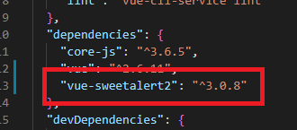
Register SweetAlert2 In main.js:
On registering SweetAlert2 in main.js, then it will be available to all components of the application.
src/main.js:
import Vue from 'vue'
import App from './App.vue';
import VueSweetalert2  from 'vue-sweetalert2';

import 'sweetalert2/dist/sweetalert2.min.css';

Vue.config.productionTip = false

Vue.use(VueSweetalert2)

new Vue({
  render: h => h(App),
}).$mount('#app')
- (Line: 3) 'VueSweetalert2' loading from 'vue-sweetalert2' plugin
- (Line: 5) loading 'vue-sweetalert2' plugin CSS file. It is an optional link to load. If we want we can write our own custom CSS.
- (Line: 9) 'VueSweetalert2' injected or registered to 'Vue' instance. By doing the 'VueSweetalert2' will available to all the components of the application and can be accessed with 'this' scope as 'this.$swal()'.
SweetAlert2 fire Method:
We know that we can get 'VueSweetalert2' instance with 'this' scope in the components. 'this.$swal.fire()' here 'fire' method will open up the alert. The 'fire' method will available to us in 3 overloaded methods approach.
// with single input string parameter

this.$swal.fire('Hello');

// with multiple input string parameter

this.$swal.fire('Iam title', 'Hello','success')

// with js object literal as confugration input
this.$swal.fire({text:'Hello'})
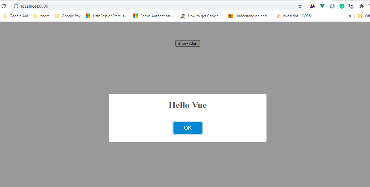
Let's begin by configuring a simple alert box a follow.src/components/Helloworld.vue:
<template>
    <button @click="showAlert">Show Alert</button>
</template>

<script>
export default {
  methods:{
    showAlert(){
      this.$swal.fire('Hello Vue');
    }
  }
}
</script>
Text And Html Properties:
The 'fire' overloaded method that takes an object literal as the input parameter is the most preferred method to get more control on the alert box.
Text property caries the description for the alert.
src/components/Helloworld.vue:
showAlert(){
  this.$swal.fire({
	text:"Hello i'm text prop"
  });
}

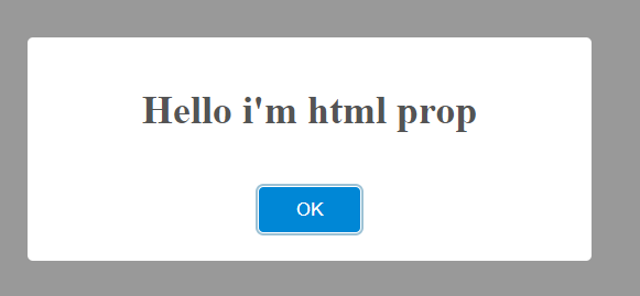
Html property also caries the description to alert. Here we can give HTML as input for the Html property. If our alert contains both HTML and text property, then text property will override the Html property value.
this.$swal.fire({
 html:"<h1>Hello i'm html prop</h2>"
});
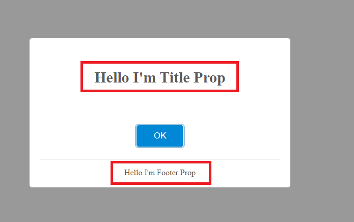
Title And Footer Properties:
The 'title' property to define the title information on the alert modal. This 'title' caries data like either text or HTML.
The 'footer' property to define the footer information on the alert modal. This 'footer' caries data like either text or HTML.
src/components/Helloworld.vue:
this.$swal.fire({
 title:"<h4>Hello I'm Title Prop</h4>",
 footer:"Hello I'm Footer Prop"
});
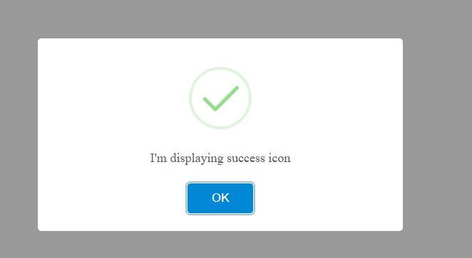
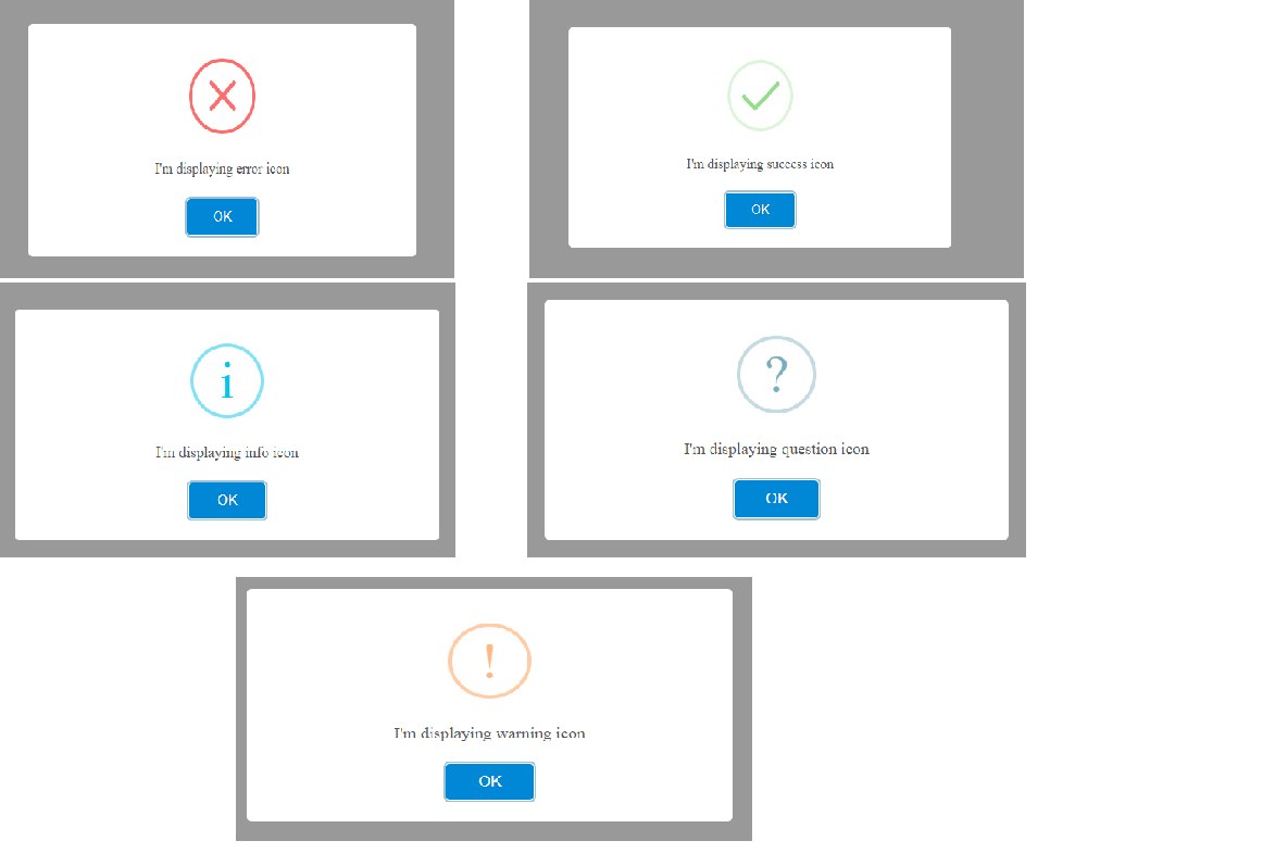
Icon Property:
The 'icon' property makes an alert property more understandable by visualizing it. The following are the keywords of icons provided by 'SweetAlert2':
- success
- error
- warning
- info
- question
src/components/HelloWorld.vue:
showAlert(){
  this.$swal.fire({
	icon:'success',
	text:"I'm displaying success icon"
  });
}
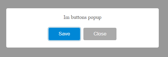
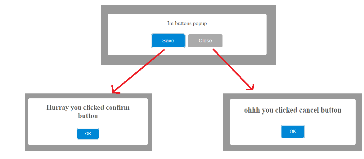
Buttons:
The 'SweetAlert2' provides us 2 different types of buttons, those all are configurable very easily. The following are configurable properties of the alert for the buttons:
- showConfirmButton
- showCancelButton
- confirmButtonText
- cancelButtonText
showAlert(){
  this.$swal.fire({
	text:"Im buttons popup",
	showConfirmButton:true,
	showCancelButton:true,
	confirmButtonText:'Save',
	cancelButtonText: 'Close'
  });
}
showAlert(){
  this.$swal.fire({
	text:"Im buttons popup",
	showConfirmButton:true,
	showCancelButton:true,
	confirmButtonText:'Save',
	cancelButtonText: 'Close'
  }).then((result) => {
	if(result.isConfirmed){
	   this.$swal.fire('Hurray you clicked confirm button');
	}else if(result.isDismissed){
	  this.$swal.fire('ohhh you clicked cancel button');
	}
  });
}
- (Line: 8) after clicking the buttons 'fire' method promise get invoked
- (Line: 9&11) status of the button clicked type like 'isConfirmed' and 'isDismissed'
- (Line: 10&12) invoking the nested alerts.
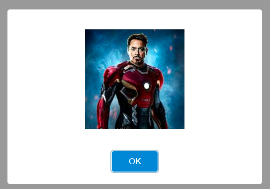
Alert With Images:
The 'SweetAlert2' gives the flexibility to configure the images on the alert modal. The image configuration props like 'imageUrl', 'imageAlt', 'imageHeight', 'imageWidth', etc.
src/components/HelloWorld.vue:
showAlert(){
  this.$swal.fire({
	imageUrl:"your image url",
	imageHeight:200,
	imageWidth:200,
	imageAlt:'no image'
  });
}
Timer:
We can set the 'timer' property that accepts milliseconds as value to automatically close alert after the specified time.
src/components/HelloWorld.vue:
this.$swal.fire({
	text:'I can close automatically by using timer in milli seconds',
	timer:3000
});
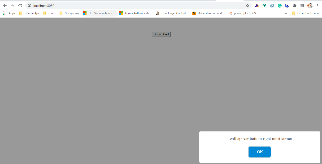
Position:
Using the 'position' property we can set the position of the alert modal to display on the window. Position keywords are like: 'top', 'top-start', 'top-end', 'center', 'center-start', 'center-end', 'bottom', 'bottom-start', 'bottom-end'.
src/components/HelloWorld.vue:
this.$swal.fire({
	text:'i will appear bottom right most corner',
	position:'bottom-end'
});
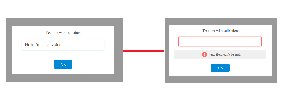
Input Types:
The alert form also supports input type fields like 'text', 'email', 'URL', 'select' etc. The alert modal supports only one field. If you want multiple fields it better prefers direct modal popups instead of an alert box. But through adding custom HTML you can add multiple fields but it is not recommended. Some configuration properties like 'input', 'inputValue', 'inputValidator', etc.
src/component/HelloWorld.vue:
showAlert(){
  this.$swal.fire({
	text:'Text box with validation',
	input:'text',
	inputValue:"Hello i'm initial value",
	inputValidator:(value) => {
	  if(!value){
		return "text field can't be null";
	  }
	}
  });
}
- (Line: 4) 'input' property to define the input type,
- (Line: 5) 'inputValue' is to carry the default value for the input type of 'text' field on the initial rendering of the alert.
- (Line: 6) 'inputValidator' for filed validation.
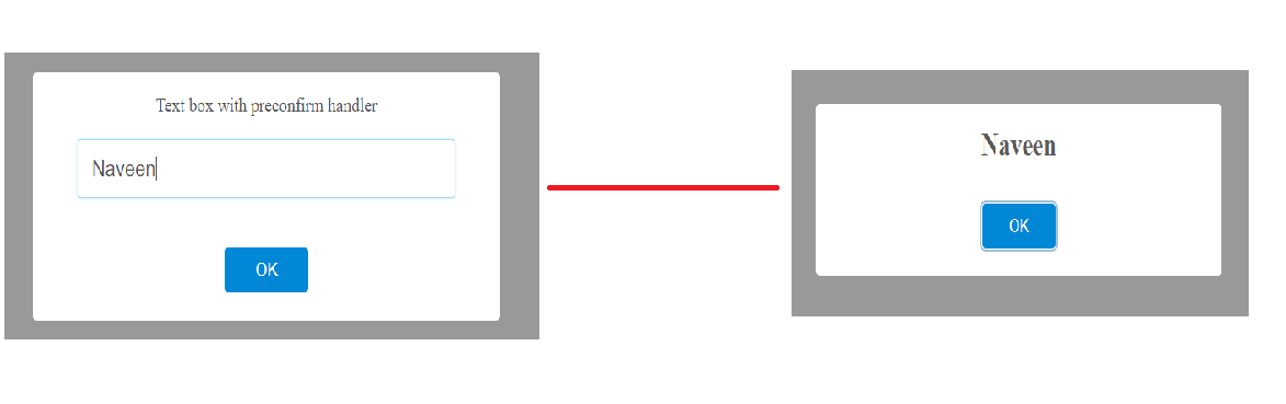
PreConfirm Handler:
The 'preConfirm' handler executes the before confirming button returns to the 'fire' method promise. This 'preConfirm' handlers are used to call ajax to fetch the data on clicking the confirm button. The result returned from the 'preConfirm' method will be accessed in this 'fire' method promise as 'value' property.
sr/components/HelloWorld.vue:
showAlert(){
  this.$swal.fire({
	text:'Text box with validation',
	input:'text',
	preConfirm:(textValue) => {
	  return textValue
	}
  }).then((result) => {
	if(result.isConfirmed){
	  this.$swal.fire(result.value);
	}
  });
}
- (Line: 5) 'preConfirm' handler triggered by the 'confirm' button. In a real-time application here we are going to call ajax request and return the payload to alert promise.
Support Me!
Buy Me A Coffee
PayPal Me
Wrapping Up:
Hopefully, I think this article delivered some useful information on SweetAlert2 library in VueJs application. I love to have your feedback, suggestions, and better techniques in the comment section below.
Comments
Post a Comment